I don't know if I can do better than that this time: you might want to just hit that link.
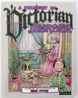
This time, writing about Rick Geary's A Treasury of Victorian Murder, Vol. 1, I want to look at the cover.
There it is: right in front of you. A cluttered High Victorian room, stuffed with things. So stuffed it takes a moment to notice the body sprawled on the floor; the woman stalking away to the right is more prominent. That's Geary for you: he'll promise murder, and deliver murder, but not be blatant about it. The murder is one thread of the story he wants to tell - the central thread, yes, the lurid thread, but all of the other objects in that room are just as carefully delineated, in his art and in his story.
And who is that in the foreground? I go back and forth: is that a child or a young woman? She could be sitting down, or she could be that short. She could be the murderess, or an innocent bystander, or a neighbor whose unexpected visit caused the discovery of the heinous deed. Her face will not give away any of that: she's composed, but not calm. Is that a worried crease to her lips? What is she looking sideways at?
She's the one element of the cover that points outward to us the readers. She's our path into this image, our guide into the story we build in our own heads about the cover image. Perhaps I need to say here that it comes nowhere near the facts of any of the three stories in the book: it's clearly not illustrating anything within. This is a pure picture, a cover to be "A Treasury of Victorian Murder." The book will not tell us how to read this image. This cover stands alone: it implies a story Geary has not explicitly told.
It's also a moment: it's a comics cover, not an illustration. The figure at the front is glancing to her left; the woman in pink is stalking out of the room. There is motion throughout - this is not a static picture, but a moment in time, a moment that will be gone instantly. Something happened a second ago, something else will happen next. But what we have is this moment, as a window into this scene and this Victorian murder.
That's what Geary gives us. The cover is larger and more detailed than most of the panels in the stories inside - though not all of them; there are a couple of fold-out double-page spreads - but it's in their style and manner. This is what we find within: questions and moments, figures and mysteries, bodies and shocks, clutter and detail.
If the cover intrigues you, the book will do more than that.

No comments:
Post a Comment