Showing posts with label SFF Art. Show all posts

Tuesday, January 16, 2018

Book-A-Day 2018 #16: Amazona by Chris Achilleos

There's no reason why taste in art should follow national borders, particularly if we're talking about popular art, designed as packaging for consumer goods. And yet there's a definite style to British SFF cover art -- more pronounced in the 1960s through '80s when the UK and US were clearly separate markets -- which is noticeably different to the American styles of the same era.

So it's not that I don't like the paintings of Christos Achilleos. It's that he works in an idiom and a milieu that I'm not attuned to; that he's spent a long career pleasing and delighting an audience that I was never part of. I appreciate his work, but I've never really seen a painting of his that I loved. (Unlike a lot of his American counterparts, from Eggleton and Whelan to Maitz and Dos Santos and Picacio.)

But I do find that difference fascinating, particularly when it's embodied in someone really skilled and passionate about his work, as Achilleos is. He's a really good maker of art, both commercially successful and willing to move away from the just commercial to make pictures the way he wants to, for vague commissions or his own purposes.

I tend to appreciate Achilleos's tighter paintings best: he works on-and-off in airbrush, and some of his work has a really tight finish and sheen, particularly for human skin. (And, like many fantasy artists, he has more than his share of paintings showing a lot of human skin, mostly female and always attractive.) That's the opposite of how I feel about some American SFF painters, particularly Bob Eggleton -- Eggleton, to me, as at his best when he's loosest, and you can see the globs of paint on the canvas. For Achiellos, though, his work always feels static to me, even the action scenes -- so the ones that are obviously posed and still work best for me, as they fit the feeling his paintings give me.

I figured out that what I like best in Achilleos's paintings are the single figures, highly detailed, frozen in a moment of contemplation or preparation. Others will have different preferences; he's worked in a number of styles and varies the tightness of his painting to suit a particular project.

So, when I realized this week that I had a book of his -- it's from 2004, and I think I've had it since then, metaphorically under a barrel, until my Book-A-Day rummagings turned it up -- I jumped right on it. And still didn't love it. But that's just the way it is.

The book is Amazona, and it collects mostly art that wasn't in his 80s-era books Medusa and Sirens because he made it since then. (Funny how that works.) It opens with a long foreword explaining Achilleos's career to date (well, as of a decade ago), including some details about his disagreements with his former publisher, Dragon's World, and how that led to the sixteen-year gap between books. (In my publishing career, I worked somewhat regularly with agents for Dragon's World in the US, but I was always on the opposite side of the table to them -- I represented someone who was paying them, while Achilleos was looking to get paid by them. The details here basically match murmurings I'd heard at the time and afterward from other artists.)

The bulk of the book is divided into three long sections: Amazons, Fantasy, and Glamor. Two of the three, as you might guess, are primarily pictures of attractive ladies wearing not very much, but what they are wearing is exotic and strange in various ways. (Fantasy art has been about the female for a large proportion of the time for decades now.) Amazons is the fantasy art, and some personal work, along with some mostly historical paintings that can function as fantasy covers. Fantasy, right in the middle, is the work that isn't mostly about the female form -- battle scenes, and a few mightily-thewed warriors, and the like -- but that doesn't mean it's entirely devoid of corseted women. And then the Glamor section has paintings Achilleos did for fetish magazines and nightclubs and some private commissions. In this section, he talks about his models a lot more, and the point of many of the paintings is to depict a particular model, because was then a moderately famous nightlife personality or just particularly striking.

I'm still not a huge fan of Achilleos, but he's very good at what he does, and has continually worked on his craft and passions over a thirty-plus year career. And who ever said I was ever the arbiter for anything?

Thursday, June 25, 2015

Posing for Vengeance

So this here new Avengers cover hit the intertubes this week, revealing the new team that apparently is exactly the same one everyone assumed it would be. (I don't pay close attention to long-underwear comics these days.)

I'm not here to berate or praise the racial/gender mix of the team -- there are plenty of other places filled with people who have scarily strong opinions on the subject -- but I do have a question.

Where are they?

They seem to be standing in a cloudbank, and I'm pretty sure several of those characters don't fly -- Spidey and Ms. Marvel, in particular. I don't know if the current Thor can hover, either, though I wouldn't be surprised if Vision, Nova, and ol' Shellhead can do so. They're also strangely crowded around the camera, though at very different levels -- are they on cloud risers?

Also, while I'm at it, what the heck is Captain America doing? Is he supposed to be coming in for a landing on his cloud riser, or just showing off his muscles?

Yes, I know it looks cool: they're all glowering menacingly at the assumed reader, and Cap gives it some movement. But what does it have to do with anything, and why should we care that they're giving us the stink-eye?

Wednesday, August 10, 2011

Complaining About Cover Art, Once Again

I still have a few moldy oldies buried here and there, the stray survivors of my attempts to bring everything I've ever written online onto Antick Musings, and, as I discover that I've missed them, I'll be remedying that problem.

Some ideas never get old -- such as saying "my favorite author's new book has a horrible cover! X'thor the Undaunted has three horns, arranged in a spiral shape, and Missy, Princess of Goats not only is much prettier than that, but she has green eyes! Why didn't the author set the artist right?" One such occasion came in April of 2002 on the Straight Dope Message Board, where I replied -- after several others saying similar things -- thusly:

Most authors have about as much control over the covers of their books as Juan Valdez does over the design of the coffee can.

RealityChuck [1] has already said most of what I could say, but let me just repeat that the point of a cover is not to accurately represent anything in the book. (Though it would certainly be nice if it did.) The point of a cover is to get people to a) pick the book up and then b) buy it. A cover that does this is a success; a cover that doesn't is a failure. Other considerations are secondary, but the next most important one is "will the reader think the book fits the cover." Angry Lead Skies has a guy in a fedora staring moodily at a whiskey glass while two fantasy types pose in the background; the book is a Chandleresque PI story set in a fantasy world -- so the cover does tell the reader what kind of book it is. Other points: Some artists and designers are better than others. The better ones tend to be more expensive and busy -- and they can't work on all the books that exist. So some books (especially mass-market midlist genre stuff, like the book in question), get covers done by people who aren't at the top of their field. (Though this obviously isn't a simple metric -- there are always great new artists starting out, and older artists coasting on their previous work.) Books that are cheaper and will make less money don't usually get the more expensive artists. Only a couple of genres -- SF/Fantasy and Romances (and not all of the latter, either) -- get the painted cover look to begin with. Most novels have stock photos or other "evocative" looking bits of art that tell the reader even less about the book. Glen Cook is a nice guy (and a good bookseller, too), but he's a very small fish in the publishing pond. He might get to recommend an artist occasionally, but that would be as far as his involvement in the cover goes. And I'd say that Garrett has a hat on the cover of most of the books because a fedora says "private detective." The only real alternative would be a trenchcoat (actually, both plus a cigarette would be the best), and I don't remember if he ever wears one of those. 


[1] Schenectady's own Chuck Rothman; as usual, the people making sense in an online discussion were all connected to science fiction.

Saturday, July 23, 2011

Hugo Thoughts: Dirty Pros (Artists)

Today in "Hugo Thoughts," I'll look at the Best Professional Artist category, another one based on vague body of work (supposedly in the given year, but, in actual voting practice, usually not). Since I worked in the SFF field myself, once upon a time [1], I know several of these artists and have worked, at least through an art director, with nearly all of them. And thus I'll probably be less sarcastic and dismissive than I am in categories filled with people I don't know; it's probably not my most attractive feature, but it is true.

Best Professional Artist
  • Daniel Dos Santos
  • Bob Eggleton
  • Stephan Martiniere
  • John Picacio
  • Shaun Tan
Dan Dos Santos did some great work for "me" back in my SFBC days -- "me" being in quotes, because he always dealt with our wonderful art director, Toby Schwartz, and I was just some editor he met once or twice. He's an excellent commercial artist, greatly in demand because he's really good at capturing the essence of a book in one of his luminous, energetic paintings. So, as a guy who sells books, I love his work. But in this category, with this competition, he comes off as the most conventional -- he does tightly realistic work in the post-Whelan manner, and I've never seen him do anything more impressionistic or painterly. He does have a sly sense of humor (in covers like Alien Tango, in this year's packet) and a fine design sense (as seen in Butcher Bird, an older cover), but the other covers chosen for the packet this year all looked like excellent illustrative work -- Dos Santos is particularly good, as Whelan and Don Maitz before him have been, with painting light effects -- but didn't, for me, transcend that category in those works, which is what I hope for in a Hugo winner. He's been nominated twice before without winning.


Bob Eggleton, on the other hand, has been nominated in this category twenty-two times before, and has won nine times. (He was what I think of as the default winner -- this is one of the categories, like Semiprozine, Fan Writer, and the old Professional Editor, that tend to stick to one person for decades at a time -- for much of the '90s.) He also sometimes does work more loosely, and I like his stuff best when he's smearing paint around, seemingly without thought, and really going to town. But his most popular work, inevitably, is the carefully-detailed retro space rockets and equally detailed dragons; the work in the packet is mostly in that vein.

Stephan Martiniere is something like the default "digital artist" for Hugo voters -- well, nearly all artists do some work digitally, but his work looks digital, slick, and utterly modern in a very influential way, and he's become quite popular as a SF artist along the way. He's been nominated in this category four times before in the past decade, winning once. Even his most representational scenes have a slight shimmer, as if of unreality, that I find deeply appealing and utterly science fictional.

John Picacio has been nominated six times before in this category without winning, but I'm sure he'll have a rocket before long; he's definitely qualified, and I think he's got the "fan-favorite" thing coming along as well. (The dirty secret of all popular-vote awards is that they're, in large part, about popularity rather than the best work, but John is a great guy and often seen at conventions, which I'm sure will put him over the top one of these years.) He's also got a great, distinctive, instantly recognizable style, which hearkens back much more to Paul Lehr, Richard Powers, and other artists of that era rather than the ultra-realistic School of Whelan. His Elric work, one painting of which was in the packet, particularly shows his strengths -- he's great with dynamics and stark, limited palettes.

And Shaun Tan is the most interesting nominee, since -- unlike the other four nominees, and unlike the vast majority of nominees in the history of the award -- he doesn't do covers for other people's books. Instead, he's a graphic novelist (or the writer/artist of books for readers of many ages, depending on how you look at it), who produced such excellent books as The Arrival (my review) and the omnibus Lost & Found (my review). I'm definitely in favor of having this category consider other "professional artists" outside the very narrow field of SFF cover art, as long as their work is clearly fantastic, and Tan's work clearly qualifies. Unfortunately, the only major work that would qualify him for this award that actually came out in 2010 -- the year in question -- is, as far as I can tell, the short film The Lost Thing (based on his book of the same name). And that movie may be totally awesome -- I assume so, but I haven't seen it yet -- but it's also already nominated itself in Short Dramatic Presentation. So I feel a little odd considering it as the reason Tan is nominated in this category. Still, I'd like to see Tan, or someone like him, win this category at some point.


All the nominees are clearly worthy, though my rooting instinct in this category is always to pull for someone who doesn't already have a Hugo rocket on the mantelpiece. If you are voting for the Hugos this year, please take a look at the actual works these five artists produced last year, and compare their actual eligible work rather than your default mental image of good skiffy art. (I'm particularly talking to you, the people who keep nominating Michael Whelan in this category a good decade after he retired from illustration.)


[1] And I'm still very willing to talk to anyone who wants to drag me back in.

Friday, December 31, 2010

Book-A-Day 2010 # 331 (12/31) -- Spectrum 17 edited by Cathy & Arnie Fenner

There are people who can write coherently for long stretches about art, making intriguing comparisons and speaking knowledgeably about techniques and influences, but I'm not one of them. When I used to have to talk about art regularly, back in my book-club days, I often resorted to waving my hands about wildly, a small store of stock phrases, and, most dependably, pointing at things in the indispensable Spectrum series of art annuals.

So that leads to two points: first, that I'll try to be brief here, so I don't stray out of my depth entirely. And second, that this series is wonderful if you want to know about the fantastic art field for any reason (professional or personal). The current volume is Spectrum 17, collecting great art created in 2009. (I've burbled about this series here for the past few years: 13, 14, 15, 16 -- so you can take everything I said in those places as read about this book as well, since it follows excellently in their footsteps.)

Once again, the "Unpublished" section is the largest, and the most likely to confuse me, but I've come to believe that the Spectrum process allows submitters to decide on the final category for a work, without changes from the judges, and so I just shrug. (Similarly, I saw illustrations from Tor.com under both "Editorial" and "Institutional" sections -- even relatively simple definitions can have edge cases.) But, once again, the real point is that there are about 260 pages of great art here: chosen carefully by a panel of excellent artists and designers, organized and labeled by the Fenners, and presented in a fine book on good paper.

(The "Unpublished" section used to occasionally vex me, since it was not unknown at my old job to troll that section for works that might be suitable for upcoming projects -- though it always seemed to turn out than any specific "unpublished" work had found a real home by the time we asked about it.)

If you work in any of the fields strongly connected to fantasy art -- comics, books, games, or related areas -- you really should be paying attention to the Spectrum books. And if you just really like any of those areas, you'll probably find a lot to love here as well.


Book-A-Day 2010: The Epic Index

Thursday, September 16, 2010

Orbit's Annual Report on Trends in Fantasy Cover Art

I was saving these to blog about, and then I noticed it's been nearly a month -- which is about a century in Internet years.

So you've probably seen them already. But, if not, go check out:
It's mildly sarcastic, but in a loving way, and where else will you find a serious discussion of the place of "glowy magic" in the genre?

Friday, July 02, 2010

Book-A-Day 2010 # 149 (7/2) -- Spectrum 16 edited by Cathy & Arnie Fenner

Annuals are difficult books to critique -- either a critic has to first establish a baseline from previous books in the series (and risk diving too far into minutia and losing any less-than-completely-devoted readers), or has to go in completely the opposite direction, and act as if the book in hand is the only thing that matters (which has its own problems). Art annuals add an additional layer of complexity -- what we might call the dancing-about-architecture issue -- in that what's most important and vital about any piece of art can't be translated into words in the first place.

For more than a dozen years, I didn't worry about the Spectrum annuals -- as always, collecting the best in "fantastic" art (a deliberately broad term, left to be interpreted widely by entrants and judges) of the previous year, curated by Cathy and Arnie Fenner and judged by a new panel each year -- but just bought them for my then-employer, the SF Book Club, and let our staff copywriters figure out the proper words to describe just how swell they were. (And, even there, the copy tended to be short, full of adjectives and names of artists -- since we could actually show art, which does a better job of selling an art book than any number of words can.) More recently, I've been an ordinary schmo, and buy them for my own shelves.

Last year, I said most of what could be said about Spectrum 15, and nearly all of that applies to this year's book as well. It's, as always, the best look at what's going on in all of the pieces of the fantastic-art world, from advertising to magazines to book covers to comics to statues to even less likely things. (There were a bunch of great opera posters about five or seven years ago, for example.) If you like imaginative art, this is the book to get every year; it's just that simple.
Book-A-Day 2010: The Epic Index
----------------
Listening to: Ann Vriend - St Paul
via FoxyTunes

Friday, March 26, 2010

Book-A-Day 2010 # 51 (3/26) -- Rough Work by Frank Frazetta

More than a decade ago, Cathy and Arnie Fenner began a project to present all of the major works of the quintessential heroic fantasy artist, Frank Frazetta, in handsome large-format art books. After editing three gorgeous and essential books -- Icon, Legacy, and Testament -- from 1998 to 2001, they were done.

But then, another six years later, they also edited this smaller, less comprehensive book, Rough Work. As the title indicates, it's a collection of Frazetta sketches and roughs, from throughout his career (with an emphasis on the '70s, as far as I could tell), in a 6x9 book with a puffy paper-over-boards cover. (Don't ask me why it's puffy -- I haven't seen that style outside of childrens books -- but it definitely is puffy.)

The three big books also included a lot of Frazetta preliminary drawings and sketches, but Rough Work includes, mostly, pieces that aren't in any of those three books. So completists will want it -- though they likely bought it in 2007, when it was published.

There's an introduction by Arnie Fenner about Frazetta; it's more of an appreciation or a celebration than an attempt at even a capsule biography or a critical view of his work. And that's just fine; the audience for a books of Frazetta's sketches and roughs knows just fine who he is.

There are a few relatively finished pieces here, such as a short section of Frazetta's designs for an aborted mid-70s animated Dracula, and plenty of fully-developed drawings from sketchbook pages, but the color work is generally very loose and indicative rather than finished; Frazetta liked to leave himself a lot of the work (and the exploration of the image) to be done in the final art, so his roughs were always clearly roughs.

And the matter of the art is the usual for Frazetta: a little Tarzan and Conan and John Carter (not much, since most of that work was in the other books), plenty of dinosaurs and big cats and spaceships and axe-wielding Vikings and other thinly-clad barbarian types, and a whole lot of fleshy undressed Frazetta women. A lot of that art is loose, but all of it is energetic and just right; this is all art from Frazetta's mature years, so even the sketchiest pieces are the sketches of a smart, talented working artist who knew just how to see and to draw.

This book isn't nearly as essential as the big Frazetta books are, but it's a pleasant look at the minor works and pre-works of one of the best illustrators of the late 20th century, and that's good enough.

Book-A-Day 2010: The Epic Index
----------------
Listening to: Be Your Own Pet - Bunk Trunk Skunk
via FoxyTunes
 

Wednesday, August 12, 2009

Another Thing I May Possibly Have Been the Only One in the Universe to Notice

The cover to the next Jim Butcher "Dresden Files" book (Changes) has been posted on a bunch of pages around the 'net, sparking the usual conversations. (So far, I haven't seen anyone say that he utterly loathes it, or that it's raping his childhood, but the day is still young.)

I seem to be the only person whose first thought was, "Huh. Guess Butcher is abandoning his previous titling scheme."

You see, all of the previous Dresden Files novels had two word titles, and the two words always had exactly the same number of letters in them. And I may perhaps have been the only one who took note of that, for what it's worth. I'm not sure if that's perspicacity or OCD, but I've got it.

Saturday, August 08, 2009

The Bad Cover Contest Rolls On

You know, I do a lot for you folks, and I don't ask for much. (I don't even explicitly ask about all of my Amazon links, preferring to leave that to implication and guilt.) One of the very few things I did ask for was for you to vote for my title in Orbit's big ongoing Bad Cover saga.

But it didn't work -- you folks may have voted loyally (for all I know), but Rise of the Fallen, Book Seven: The Pre-Antepenultimate Battle lost -- lost!!!! -- to Across a Trembling Sea the Cyborg Fairies Dance.

I'll get over my soul-crushing disappointment eventually. And there's still a chance for a little bit of glory -- Orbit is now looking for an author and a cover reading line for this book. So go and do your worst.

Tuesday, August 04, 2009

A Certain Book Club Has a Cover-Art Contest

SF Scope has the details of a contest to create art for the catalog of the Science Fiction Book Club.

Unmentioned is the actual payment for this piece of commercial art. That's just an oversight, right? The winners of the contest will be compensated for creating a professional-quality piece of art not just by publication, but by a standard fee, yes?

There are "contests" in which pure publication is the prize, and those are not good things. I'd hate to see the SFBC joining their ranks.

Tuesday, July 21, 2009

The Search for the Worst Cover Ever Continues!

Orbit is in the middle of a promotion to create the worst SFF cover ever, which I think is a wonderful -- and totally achievable -- goal that reflects very well on them as an organization. I'd mentioned their plan once before, when they were looking for title suggestions for that book.

Their plans have now hit the next level; they have five potential titles -- some of the worst possible titles for SFF books ever -- and are asking readers to vote on which one should be immortalized.

And one of those titles -- Rise of the Fallen, Book Seven, The Pre-Antepenultimate Battle -- was suggested by Your Humble Hornswoggler.

Now, I don't think it would be entirely right if I were to urge you to go to the voting site -- which I've conveniently linked RIGHT HERE -- and vote en masse for that title...so I'm not going to do that.

But I do urge you to vote for whichever title you think would make the best bad cover.

----------------
Listening to: Dish - Zombie Love Song
via FoxyTunes

Monday, July 06, 2009

Help Make the Worst SFF Cover in the World

Orbit, the SFF imprint of the Hachette folks, knows that all of us on the Internet like to do nothing more than complain about cover art. But, unlike those other publishers, they're going to do something about it.

They intend to create the worst SFF cover ever.

Sure, the competition is high -- what about this German horror for a Lois Bujold novel? -- but I'm confident that they can do it. They will need your help, though: right now they're still looking for the perfect bad title.

So go to Orbit's blog and enter your suggestions for the worst possible SFF title. You might even find that someone has been there before you, with some titles (he said modestly) that are about as horrible as can be imagined.

----------------
Listening to: Sly and the Family Stone - Everyday People
via FoxyTunes

Friday, February 06, 2009

This Just In

Epic Fantasy fans think girls are yucky. Author is amused.

No, no, we certainly don't want a girl on the cover of our gritty, tough fantasy novel, do we? (Even if that girl is the main character.) If we let that happen, girls might read the book, or talk to us, or something, and that would be horrible.

(There's a side order of "Ooh! A Map! Shiny!", but I'll leave that aside for now.)

And, yes, de gustibus non est disputandum, but the immediate and one-sided reaction is certainly eyebrow-raising.

Thursday, January 01, 2009

Spectrum 15 edited by Cathy & Arnie Fenner

The fifteenth annual for the best in the fantastic in art has a cover that looks less genre and more upscale than usual -- I wonder if that was deliberate? (Some online sellers, like BN.com, have what I suspect was a earlier cover design, with a great but more genre-looking cover from Jon Foster.) Or maybe that cover was chosen because it features a scantily clad young woman? (Always popular.) Or maybe because it's by Michael Whelan? (Still a name to conjure with.)

Whatever the reason, it's a classy cover to a collection of great art from 2007 -- not always classy, but always excellent. The works included in the book were chosen by a panel of judges, nearly all of them artists themselves, and arranged by the Fenners. (Arnie Fenner also provides his usual long introduction, which was thankfully less political than the last few.)

As usual, the art is divided into several broad (and occasionally overlapping, though there seems to be less of that this year) categories: Advertising, Book, Comics, Concept Art, Dimension (3D works; sculptures, mostly), Editorial, Institutional, and Unpublished. A couple of the "Unpublished" works in particular are categorized oddly: if a work lists an art director and a client, and that work is already appearing (or about to appear) for that client, it's not really "unpublished" in any reasonable sense.

But, really, Spectrum is about the art, and that's stunning. There's a wide variety of styles, from CGI realistic to smeary-paint impressionism, with many side trips along the way. As a whole, it tends more to the realistic end, but there's still a lot of variation in finish and point of view. This year's book is 264 pages long, and most of those pages are filled with great art -- also, the art is displayed and reproduced well, with useful credits.

I don't commission book-cover art anymore, but I still get Spectrum to see what's going on in the fantasy-art scene. It's vital for anyone interested in that world.

Wednesday, September 17, 2008

Art Director Speaks!

The SFBC's current art director, Matthew Kalamidas, has been interviewed by Irene Gallo for Tor.com.

Matt's a good guy and a fine art director, though I never worked directly with him. (The 2007 event was breathtaking in its scope.) And I'm always interested in seeing behind-the-scenes publishing pros talk about what they do; there are a lot of agents and editors out there, but not many people doing other things.

However, I was surprised to see that the club did a new cover for Charles Stross's newest novel Saturn's Children (Here's the SFBC page, and here's the Ace cover at Amazon.) Perhaps things have changed -- have I mentioned that a lot of people who used to work there are now gone? -- but the long-time opinion of the legal folks used to be that if you gave a book a new cover, you couldn't compare it to the publisher's edition -- because it wasn't really comparable anymore.

(I probably can still remember that because it's one of the very few obvious and reasonable things a lawyer ever told me.)

I'm also amused that someone at the SFBC hated that cover so much that the club went to all that time, effort, and expense of making a new cover when there already was one ready-made. But that's the thing about covers: no matter what you do, there's always going to be somebody who hates it.

Monday, June 30, 2008

Reviewing the Mail, Week of 6/28: Not Comics

Once again, the comics part of the mail is too big to fit into a reasonable-size post with anything else, so it'll be broken off by itself, slightly later. And what I have here is:

Brandon Sanderson's The Hero of Ages, third and final book of "Mistborn," coming from Tor in October in hardcover. This series has been acquired by an editor who's a friend, it's gotten excellent reviews, and Sanderson has even been tapped to finish Robert Jordan's last, unfinished "Wheel of Time" novel, which is about as big a vote of confidence as a writer can get. But I haven't yet read the previous books, so I can only give you hearsay -- people I trust say these books are good, and now the trilogy is complete, for those of you who wait for that.

The Dark River by John Twelve Hawks in mass-market paperback, July. The interesting story for me here is that it's a mass-market by Vintage, an imprint that's used for that format only very rarely. It's the second novel in a don't-call-it-SF series, which has not caught the Zeitgeist in quite the way it hoped to. (Though there's something mid-90s about this series, with people "off the grid" has the heroes -- that's more X-Files than 24; we generally prefer our heroes to be finding and torturing the people off the grid these days.)

The Last Realm Book One: Dragonscarpe is an absolutely immense piece of heavily-illustrated fiction by Pat McNamara, Michal Dutkiewicz and Gary Turner, published by what looks like a brand-new press, Angel Phoenix Publishing. I'm not sure if this Gary Turner is the same as Golden Gryphon's Gary Turner -- this one is described as a publisher and musician -- but it's possible. It's a very major, professional-looking thing to come out of nowhere, and I wonder what kind of distribution they're getting for it. I've only just started poking at it, and I'm really not sure what to make of it. There's a corporate copyright -- D.R.E.E.M. TV Pty. Ltd. -- which may indicate that it's being funded by someone-or-other's money in hopes of becoming a big media event. (Or it may just indicate that the three creators have incorporated to keep it all straight.) If any of you have the chance to look at this in person, take it.

I'll mention one book I got from the library just because: John Varley's Rolling Thunder. Varley's been writing vaguely Heinleineque young adult SF novels for the past few years -- which has felt a bit like slumming after his great '90s novels Steel Beach and The Golden Globe -- but getting a new Varley novel nearly every year is still a wonderful thing. This one is the third in the loose series with Red Thunder and Red Lightning; I'm not sure why nothing is read this time. (Perhaps he's referencing one of my favorite old video games? Stranger things have happened.)

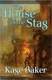
And last is the book that excited me the most this week: Kage Baker's The House of the Stag, a new fantasy novel set in the world of The Anvil of the World. Tor will publish it in September. I don't know much more than that now, except that I want to read this if I can find any time at all.

Thursday, January 10, 2008

Spectrum 14 edited by Cathy Fenner & Arnie Fenner

I "read" this more than two weeks ago now. (Actually, there is a very long, and occasionally tediously political, introduction from co-editor Arnie Fenner, so there is something to "read" here.)

On the egoboo front, there's a great piece from Stephan Martiniere, art-directed by Nicholas Sica (who lost his job from That Company at the same time I did) and for one of the books in the SFBC 50th Anniversary Collection (which I conceived back in 2002 and then acquired and published 40 books over the next five years). Congrats, Nick! (The art is for Neal Stephenson's Snow Crash, and is on p. 51.)

Also from the old digs is a nice piece by Patrick Arrasmith, on p. 152, art-directed by David Lai. (I never met Lai, which I think just shows how talented, and deep, a bench of art directors that now-gone iteration of the company had. It was full of great creative professionals, doing hard, wonderful work every single day.)

But, besides the stuff I have a tenuous connection to, there's also another two hundred and twenty pages or so of great art from 2006 in this book. I used to get the "Spectrum" books because I was choosing artists and deciding on art styles for SFF books; now I get it just because the art is amazing and inspiring. They're great books, and they only get better year-to-year.

Wednesday, August 01, 2007

Congratulations to Nicholas Sica!

Nicholas Sica, the Art Director for the Science Fiction Book Club for the last several years, was nominated for a Chelsey Award this year in the "Best Art Director" category. And a painting he art-directed, Todd Lockwood's stunning wraparound cover for the Naomi Novik's Temeraire: In the Service of the King, was also nominated for a Chesley in the Hardcover category.

John Picacio has the full list of nominees, which includes a lot of other great work.

But I give particular congratulations to Nick for all of his great, hard work (in an area that often doesn't get a lot of recognition) and wish him the best of luck in whatever comes next.

Wednesday, July 25, 2007

The Thrilling Comic Book Cover Art of Alex Schomburg, compiled by J. David Spurlock

I have no memory of buying this, and it was published in 2004, so it's probably been stuck in the middle of a pile for quite some time. But I finally got to it.

There's minimal text: just an introduction by Spurlock with the thumbnail version of Schomburg's life and career, and captions for each cover. The covers appear to have been reproduced from comics, but the images are nearly always clean, crisp, and color-corrected. (This book doesn't make the error, common to some modern designers, of treating old art as a yellowed, textured design element, but instead thinks of it as art and tries to reproduce it as well as possible.)

From Spurlock's introduction, I learn that Schomburg painted 199 comics covers for Timely from 1939 to 1949, and 296 for Standard over the same period. This book reproduces a hundred and two of those covers, in no obvious order. (It also only contains a handful of covers from 1940 and otherwise concentrates entirely on works from 1945-1948 -- with a few stray 1944 or 1949 pieces -- for no stated reason.) It's really a book for people who would prefer to look at pictures rather than read.

Those pictures, though, are in large part not to my taste. I did like some of the airbrushed work (under the pen-name Xela) of the later years, which prefigures Schomburg's later SF book-cover work. But the bulk of the comics covers are just flat, muddy color over decent pencils, and are very much of their time. The earlier covers also tend to be crowded and muddled, while the later works show much better composition and use of negative space. It's hard to put my finger on what makes Schomburg's "Black Terror" covers bland and something of a similar vintage (say, by Frank R. Paul) more interesting, but I think part of it is that the more SFnal and fantastic Schomburg's work gets (with jungle girls and alien spaceships), the better I like it. His crime-fighters and super-heroes are derivative and uninspiring, but his female heroes are specific, original, and exciting.

(I suspect Spurlock agrees with me, since he generally uses the pictures I think of as better as full-pages and uses the lesser works in a smaller size.)

Anyway, some of this stuff is good (to my eye) and some is not so good. The book will not be of much use to scholars, since there's hardly any text, but it does reproduce the art nice and large on good paper without any design silliness. I do wish the covers had been organized, because I kept flipping backwards and forwards to look at them in sequence. But, all in all, it is a good thing.